Customer Onboarding Interface Rebuild
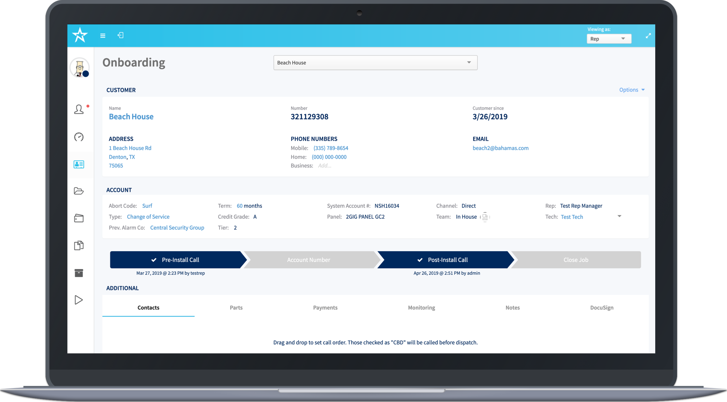

I was the sole experience and interface designer as well as the front-end developer that would build it. I worked with an Agile team of 2 developers, product owner, and the company executives.
NorthStar's account creation system was outdated. It was built over 10 years ago and features had been added over the years but was becoming increasingly difficult. The interface was limiting speed and accuracy.
The development team, of which I'm a member of as a front-end developer, frequently run into restrictions when trying to implement new features, causing several version of code libraries being loaded and dealing with conflicts. The amount of time the developer team spent dealing with this technical debt was slowing down other projects. Designing and building a better system on newer technology would allow for more stability, increased speed of task completion, and a reduction in bad data entry.
This was a project for internal use at NorthStar. Since almost all departments within the company use this site, the focus user was the Customer Care and Account Creation teams whose primary job tasks were completed through this interface.
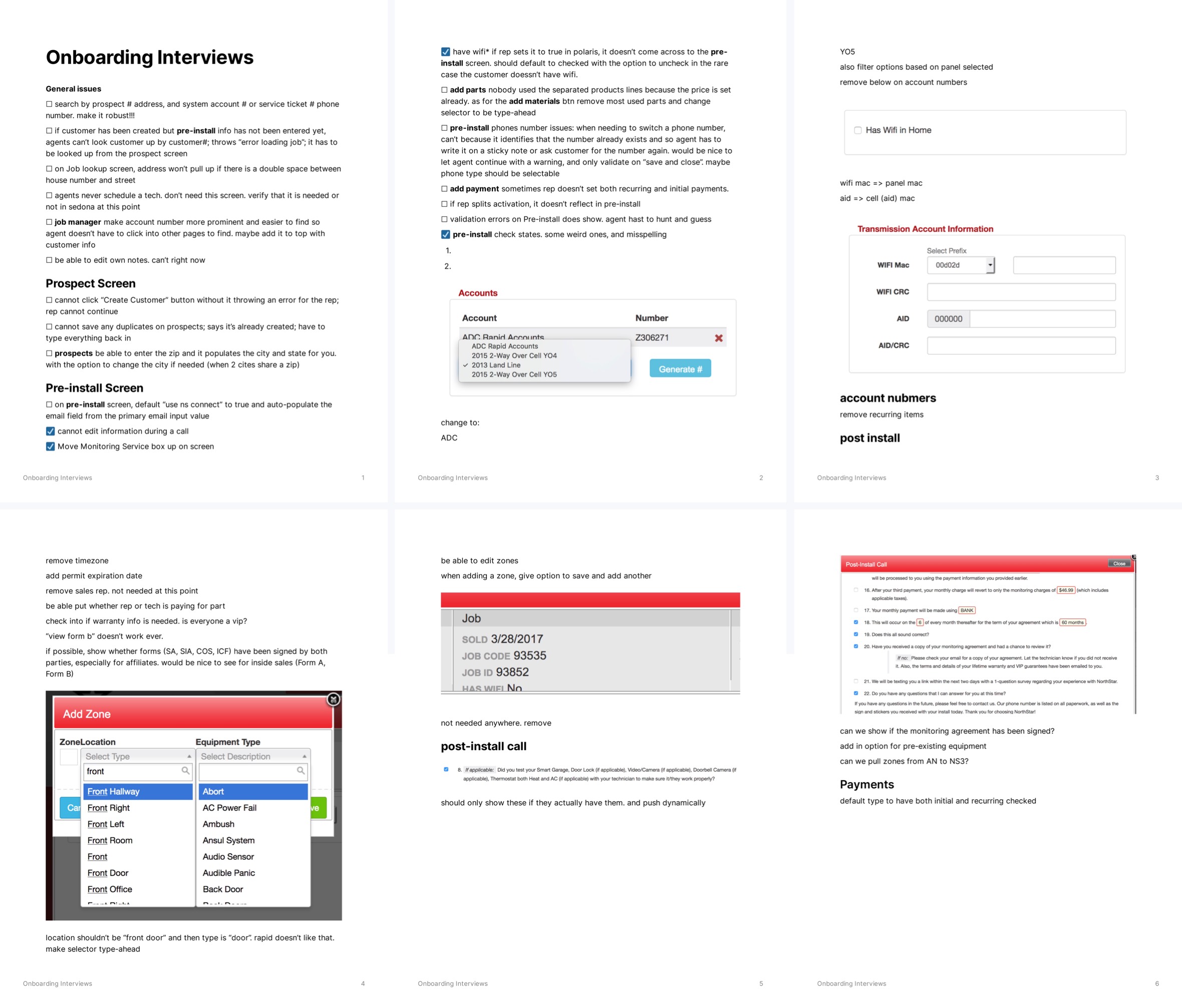
Through a series of interviews and from observing user behavior as they used the interface, I was able to identify where they fought against the interface and what they wished it to do. Walking through the site with them helped me understand how they used the system. I was able to identify manual processes that were created to work around the system. Some of these manual processes had been in place for so long that when asked why some could only respond with "That's how I was taught to do it."
Notes taken during user interviews.
As this project would affect most departments, there were many stakeholders; department managers, directors, and executives. Progress was presented and feedback was given in frequent stakeholder meetings.
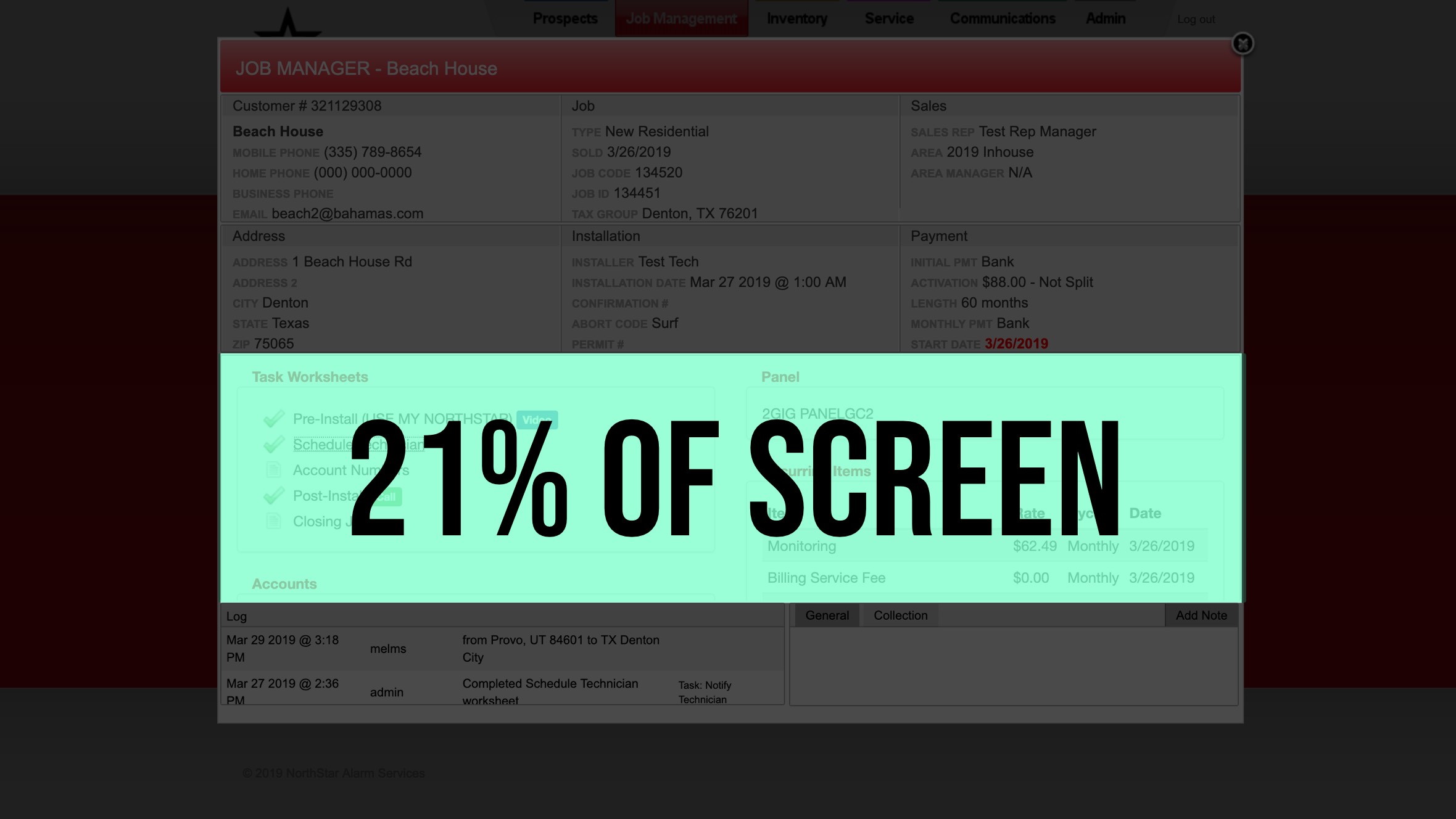
This is how much space the users had to work with.
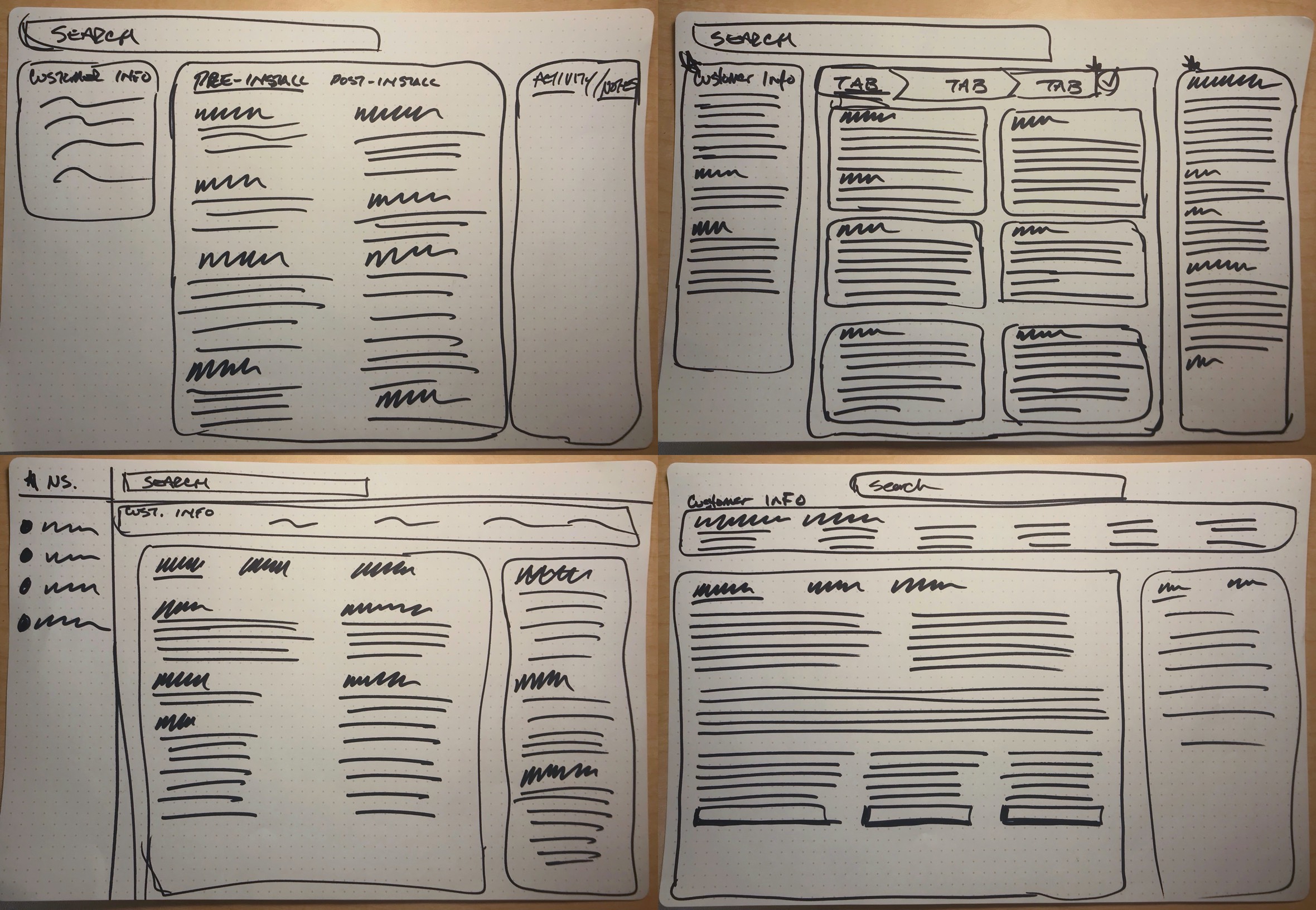
I knew that the new system needed to be responsive to the user's screen and utilize as much of it as possible. I quickly sketched out a few options.
Quick sketches of possible layouts.
As a development team, we had recently built out a new admin console for our sales teams built on Angular and it was decided to build this new site on the same platform. Since I am both the designer and the front-end developer, this allowed me to quickly build a prototype and push it to a test server where any of the users and stakeholders could test it and provide feedback. This also made it easy to make changes based on feedback and deploy it for more testing.
I reorganized the information architecture to allow the user to easily access any customer information they needed to update while on the phone with a customer.
I designed a dynamic slide-in panel that loads the call script while maintaining access to all customer information. Entering or updating information is no longer restricted.
The end product provided a clean interface to manage customer data at any point in the customer account onboarding process. It provided more flexibility for entering information.There is a continual process of updating and adding to this interface as business needs change. But now, the interface and the system can handle them.
Video of responsiveness in final product.
There were many stakeholders involved that had their opinions on how things should be. I learned to listen and to validate but not implement everything. I had to keep a keen focus on the primary user. As the sole interface designer, it can be overwhelming to respond to all types of feedback.